
Thai Smile
Mobile Applicaiton
Overview
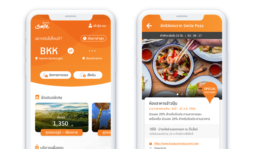
Princ Health is an application that connects to affiliated hospitals of the Principle Healthcare group to provide patients with greater convenience for medical care service.
My Role
- Lead the design for the whole project
- Understands and improve current usage flow
- Developed and maintained a design system
- Interface Design
Overview
A flight booking application for Thai Smile that allows users to manage reservations, check-in, and explore special privileges.
Challenge
The existing version of the Thai Smile app has been in use for a significant period. Its user interface is outdated, with a key issue being the dominance of the sales area on the homepage, leading to challenges in visual hierarchy and usability.
Approach applied in this work
Define Problem
- The current design feels outdated, with visuals that lack appeal and screen sizes that do not align with modern device viewports.
- Additionally, the sales area dominates the homepage, making it difficult for users to complete their primary tasks efficiently.
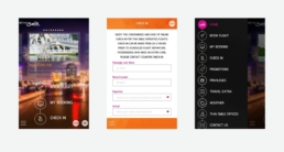
The issue with the existing version is that the interface is outdated and lacks a strong visual hierarchy.
Solution
- Create wireframes for user testing.
- Enhance the visual hierarchy to improve usability.
- Develop a new information architecture to provide better structure and clarity.
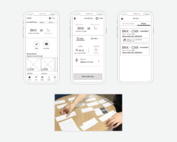
Prototyping with paper wireframes was conducted for user testing, focusing on scenarios involving flight search and booking processes.
In addition to improving the usage flow, information architecture, and overall appearance of the application, we need to validate our approach with the client. Results from the low-fidelity wireframe testing have shown that users primarily want to focus on completing the main booking task without being distracted by an overly prominent sales section.
While we have retained the sales section on the homepage, we have reduced its prominence and introduced a dedicated sales area in a new menu to better balance user needs with business objectives.
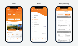
A new user interface designed to make booking more accessible for our users, while also offering quick access to manage existing bookings.
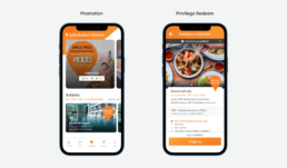
Promotions and privileges, which are vital to the business, remain a priority and have been reorganized into a single area for better accessibility.